
FiveThirtyEight Design Proposal
As a frequent visitor of FiveThirtyEight and a User Experience Designer/Researcher, I noticed there were opportunities to improve the user experience of the 2018 election forecasts. In order to validate and select three of the more important issues I conducted unscripted qualitative research sessions with six participants. An effort was made to keep the demographics represented in the participants spread across familiarity with the site, age, and gender. Anonymized data is available on the participants on request.
The following design change proposals are meant to address the three opportunities that appeared to affect the research participants the most, and improve the user experience of a wider base of visitors to the site.
2020 Update: I am happy to see that the design team at FiveThirtyEight made changes in their 2020 Senate Forecast that were very similar to my proposals. (See Below)

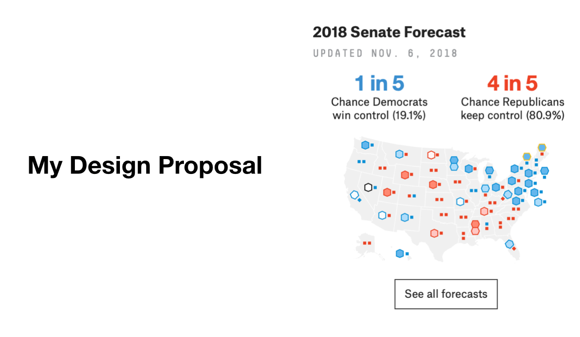
Senate Forecast Visualization
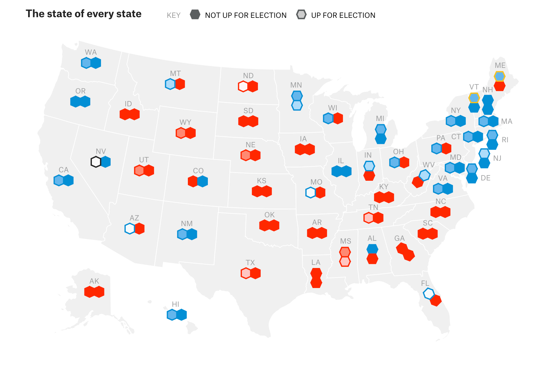
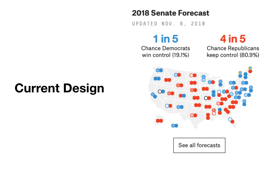
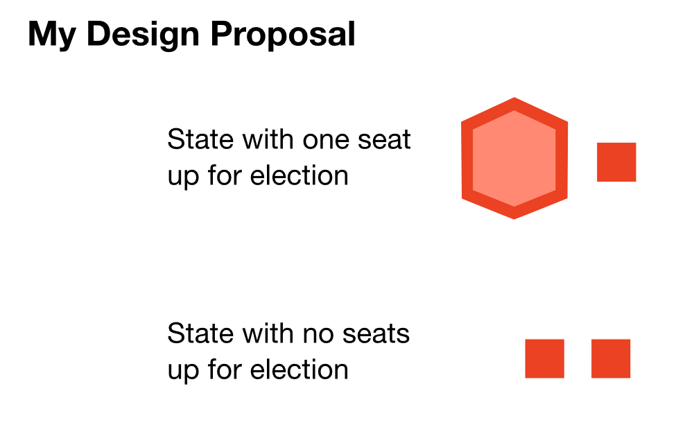
The first opportunity I found was a simple fix. In order to help the user scan the Senate Forecast more easily, the seats that are up for election should be presented in a way that is easily separable from the seats that are not up for election in this election cycle.
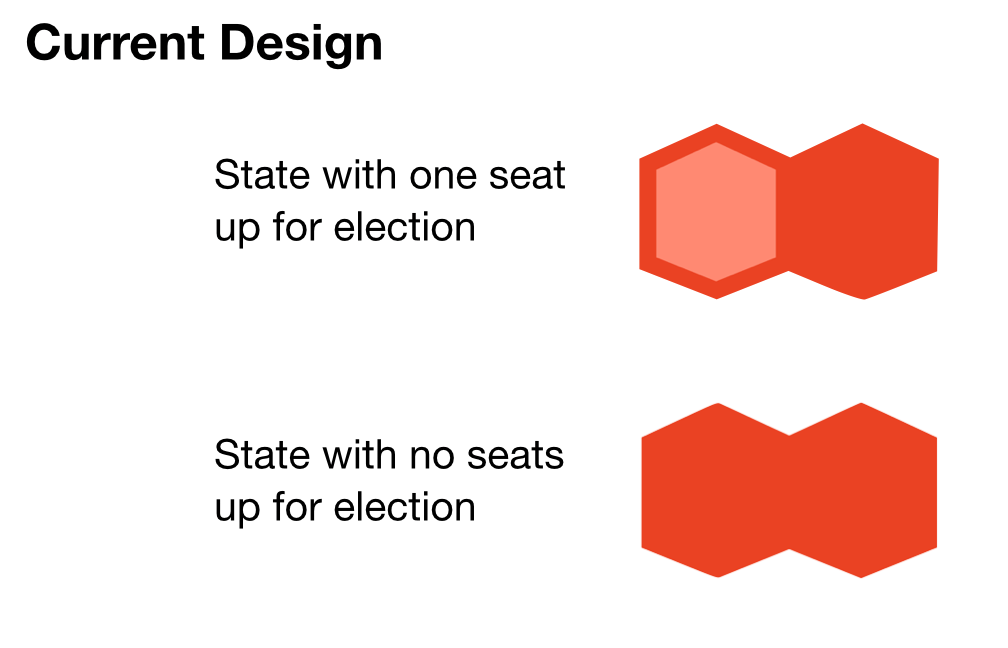
Currently, the difference between these seats are only distinguished by the fill of a hexagram used to symbolize each seat. While this difference is easily distinguished when looked at individually. It is much harder for the user’s eye to distinguish between these when looking at the map as a whole.
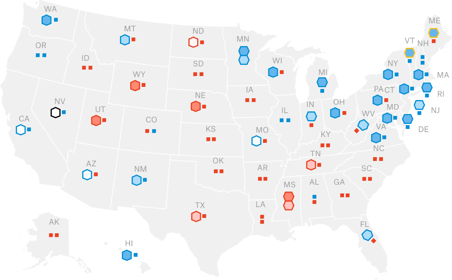
Exploiting Gestalt laws of grouping could help fix this by changing the size and shape of the seats that are not up for election. This design fix has the seats that are not up for election represented by smaller squares, so the user can focus on the races that are in the current cycle.
In my opinion, this design change helps better reflect the state of the race. When looking at the map in its smallest form (side column), it is easier to distinguish that most of the seats that were up for election in 2018 were democratic-leaning. This fact could help readers give context on why they saw democrats doing much better in the House than the Senate in 2018.
Probability Top Line
The next opportunity I noticed was in the way the midterm forecasts were discussed. From the Drudge Report to FiveThirtyEight podcasts, there were countless cases of reverting to using percentages. While there were some efforts to discuss probabilities in fractions (“2 in 3”, “4 in 5”), this friction in the user experience presented an opportunity to improve with the next model.
In the qualitative research I conducted on the presentation of the model, there was a common cause of this friction. Participants who frequent the site and those who didn’t were both confused by tracking the changes in forecasted chances. For example, for the people I interviewed, it was easier to absorb a change from a 66% to 83% chance than it was to absorb a change from a “2 in 3” to a “5 in 6” chance. While this mental math could be easier for people who are familiar to it (statisticians and gamblers), those without a mathematical background had trouble with it. Therefore, a change could be helpful for new visitors and readers, but it would need to be weighed against any adverse reactions from users who frequently use the site.
One way to help new visitors get less burdened by the mental math is to lessen the amount that needs to be done. While it may break some laws of simplification, keeping the denominator of the reported chances the same, whatever the numerator is, could be a first step to simplifying the math for readers. For example instead of reporting a change from “5 in 6” to “2 in 3”, it could be reported as a change from a “5 in 6” to “4 in 6” chance. This could have adverse reactions from some mathematics professionals, it would make the change in the forecast much more easily understood.
The only problem with this method is that there would need to be a denominator decided on from the beginning that would not change. This denominator would have to be large enough to precisely reflect the race, while small enough to be easily absorbed.
For this, it may be useful to look for inspiration in skeuomorphism. This method found in interaction design aims to provide users with something they can relate to from their own experiences. Six-sided die are common objects used for probability mechanisms, so it could serve this purpose well. Using 6 as a constant denominator could deliver a simple top line to the forecast, while having the added benefit of visualizing probabilities in ways readers without an understanding of statistics can easily absorb.


Thinking Probabilistically
This dice metaphor is useful for more than just the top line. It could also useful for solving another problem I noticed in my research and conversations I’ve had about the model.
While FiveThirtyEight does not dictate the tone of all discussions about elections, it has the opportunity to provide readers with tools for many of these discussions. The 2016 presidential election was a prime example of this. Consensus in the media gravitated towards a Clinton win being a forgone conclusion. While FiveThirtyEight’s forecast had Hillary Clinton as the favorite to win, Donald Trump still had a sizable chance of winning. Whether it was because that possibility was a difficult pill to swallow for some, or because the media’s portrayal of the race, there were many discussions after election day on the topic of “the polls had it wrong”. I see this as an opportunity to help visitors to the site understand the probabilities being visualized.
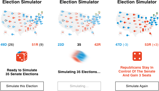
By demonstrating this dice metaphor in a feature on the left side of the election forecast page, visitors could appreciate these probabilities by interacting with them.
When “Simulate this Election” is clicked, this feature would select one of the tens of thousands of simulations that have been run for the current forecast and present it in a small format. This could give the visitor a taste of what that hypothetical but possible result would look like. Played enough times, this small interaction would build an appreciation for the more common outcomes and the outliers that occur, but less frequently. In other words, this feature could help visitors of the site “think probabilistically”.
For example, if this were applied to the 2016 presidential election, Clinton would have around 4 sides of the dice in the middle of the feature, while Trump would have had 2. Having visitors to the site play with the “Simulate this Election” button might have provided some of them with a greater appreciation for each candidate’s probability of victory.
Final Product
Here you can see how the layout of the Forecast page would look if all three design suggestions were included (Redesigned Senate Map, Dice-based Top Line, and Election Simulator).
While testing this concept with my research participants, I received feedback from a participant who works in public opinion polling that omitting the raw percentage of the probabilities would gloss over the amount of hard work put into being that accurate. Therefore I did not attempt to change how the percentages are reported in the forecast.

Final Note
These design changes are based on research, but should be considered suggestions. They are mostly aimed at helping newcomers to the site and readers without a good understanding of statistics. While I used qualitative research and iterative design practices to create these suggestions, the talented people at FiveThirtyEight have more and more valuable data on their users and the use of their website. The design decisions they’ve made with that data have helped give the site the success it deserves.
Thank you,
Sinan E Arkonac