

UX Design/Research at Fareportal
At Fareportal I researched user bases, ran ideation sessions, presented new solutions and products, and help develop the user experience of travel e-commerce for web, mobile, and other platforms. While Conversion Rate Optimization was the goal of most projects, the skillset I gained from this role grew with the nearly 2 years I worked there. The responsibilities I had at Fareportal varied as I was a shared resource working in an agile environment. Here are a few examples:
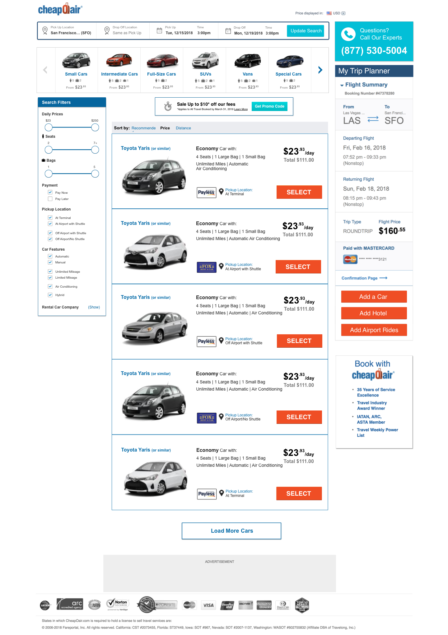
Car Rentals
The redesigns of the Car Rental listing page presented an interesting challenge. Due to a lack of development resources I could not redesign the outdated visual elements of the page, but instead had to use the elements available to design a better user flow to the page that was less visually tasking. The new designs overhauled the search bar, added a car type filter feature to the top, reorganized the display of each car listing (seen below), and simplified the search filters on the left bar. Implementing these changes lead to a 32% increase in sales.
Process
Goals: Simplify the UX of car rentals AND increase sales
Limitations: No visual designers and not enough time to develop new visual design
Step 1 (Qual & Quant Research)
With Usertesting.com, I conducted think-aloud studies of 8 gender and income balanced participants (to be reflective of our user base). Participants were given the same task of finding a car rental for a pre-organized vacation. Users found issues in finding the filters bar, organizing by what type of car they were looking for, and understanding where they would pick up the car.
Quantitatve research picked up a lot of similar issues with heatmap showing a lack of users scrolling (compared to similar flight listing pages), and a lack of clicks on the search filters.
Step 2 (Ideation & Design)
These issues were reported to the Car Rental Product manager and other stakeholders, and I organized an ideation session when requested. Using affinity diagrams and sticky notes of ideas, the ideas that balanced our need for change with our resources were brought forward. These ideas included:

Moving the filter bar to the right
Simplifying the filter bar interface by reordering the categories in order of priority and collapsing longer categories.
Removing the Matrix View Tab
Creating a new Modify Search bar
Adding a Car Type filter at the top of the page (as this was many user’s first steps)
Simplifying each listing by removing phone numbers and addresses
Simplifying pickup location descriptor
Making each listing larger to accommodate our older user-base.
After these ideas were decided on, sketches and medium-fidelity mockups were created to get quick feedback from the product managers and move forward. These quickly turned into high-fidelity mockups where I could finally communicate the important points and hand off to developers.
Step 3 (Test)
A/B Testing with a 50/50 of total traffic to the site found a 32% increase in sales with the new designs after a week of testing. This was obviously a winner and led to even greater increases (up to 200% of daily revenue) after users began to expect the new site. Below you can see the old design on the left and the new design on the right.

Frictionless Sign-Up
One of the changes I am more proud of introducing is the addition of a frictionless sign-up method. At the time the only way we were getting users to sign up for memberships to our site was a moving yellow pop-up pointing people towards a sign-up process on the top of the page. The sign-up process involved entering your email and a password. While there were more users seeing our home page, this method would take users out of the flow of looking for the tickets they came to the site for, and introduce friction.
As an alternative to this, I designed a frictionless sign-up method that would ask the user to create a password if they want membership after already having filled out the forms necessary for buying a flight ticket. This meant the activation energy required for the user to fill out any information for a membership was lowered to the bare minimum.
This feature increased membership signups by 10%.

Competition Analysis

A 3 variation test I discovered Kayak was running on its main search bar.
In a business field like travel sales there are a lot of competition over the same consumer base. Our competitors were also working on improving their products and running A/B tests as we were. Therefore I found it useful to keep tabs (sometimes literally) on what our competitors were A/B testing on a daily basis. This meant regularly cycling through them in private mode to check if I could get bucketed into any of the variations of their A/B test. Any differences were noted and put in a report.
Over time this helped us see what ideas were working for our competitors, and which weren’t. It also helped us understand which competitors were coming up with new ideas, and which were following trends of other companies. This knowledge was very helpful for planning our own tests and understanding where we stood against our competitors.
Qualitative Research
I conducted Generative and Evaluative Research multiple times a week using resources such as Usertesting.com. Tests consisted mostly of think-aloud sessions where recruited participants would run through a part of our website with a task, and would voice their thoughts and struggles while going through that task. After watching and analyzing all the videos of a particular task, I wrote and presented reports to product managers and stakeholders. Several product ideas were generated or scrapped because of the results of the tests I ran, as ideas that worked on paper were better evaluated by customers than stakeholders in the office.
